The Evolution of the Intranet Home Page
April 16, 2015
I have been thinking lately of the evolution I witnessed in the corporate intranets working on many SharePoint projects. In this post I'm going to summarize my thoughts on that evolution. This is also going to be a technology-free post.
The main difference between intranet and public web site is that intranets are not anonymous. The user browsing the intranet has a name and a username (and hopefully more than that) and this information can be used in many ways.
The "Classic" Intranet
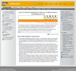
The "classic" intranet in the prehistory of SharePoint was fairly uniform in the content it presented. Little or no information was personalized for the user that was viewing the page.
The content of the intranet was "pushed" to the intranet from centralized locations such as the News Center or the Announcements of different sites. Usually, there were few people actively adding content and all the rest of the intranet users were passive consumers of that information.
So much for the "dynamic" content that was being added. However, the most of the content in the intranet was static or nearly static: telephone listings, project and department descriptions and so on. That content rarely (if ever) changed.
In consequence, the Intranet home page reflected that approach. The "push" model distributed news that were prominently displayed. There was also a myriad of shortcuts, links and navigation contraptions that allowed the user to further explore the intranet.
[
 ](https://www.edinkapic.com/wp-content/uploads/2015/03/sdg_home_feb_2010.png) SAP Design Guild Intranet circa 2007. Source: SAP Design Guild History[/caption]
Naturally, this led to the unengaged intranet users. They just had no need to visit the intranet every now and then. Only a casual visit every now and then or a fact-finding necessity would cause the users to open the intranet in their browsers.
Some companies would leverage the user information to filter the information they see on their home page, such as showing only the information that is relevant to their department. However, the most of the organization didn't have these problems as their volume of new information was low and filtering then served no purpose.
The "Social" Intranet
In the last 4-5 years the social computing technologies have made their appearance in the corporate world, after having taken the private user space by assault. The immediate nature of social updates and the viral-like features of popular content were seen as the cure for the unengaging, static intranets of the past.
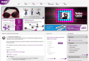
The news section was being replaced or prominently complemented by a "wall", "feed" or "conversation". It's dynamic nature ensured always-fresh content in the intranet. However, it also opened the way for information overload. From being starved to information death by old intranets to being choked by the sheer overload of information that is generated every day...in just a few years.
[
 ](https://www.edinkapic.com/wp-content/uploads/2015/03/beezyOno2013.png) ONO Social Intranet with Beezy. Source: Beezy case study[/caption]
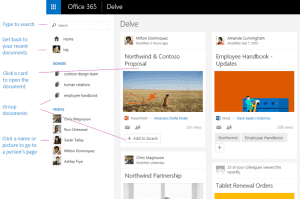
Social computing also features a network, where every users has connections to other users. It may be an explicit connection such as user follow action or an implicit connection such as having the same department. These connections are then used to show the information generated from the users the visitor is connected to. You could see documents and content created by the people you are connected to and hopefully this "social" filter capability would reduce the information overload to more personal level.
[
 ](https://www.edinkapic.com/wp-content/uploads/2015/03/delve.png) Office Delve pulled information. Source: Office support[/caption]
This filtering by user characteristics such as connections, context and behavior is what is being called a "pull" model, where the information is pulled for the current user out of the vast information overload.
To Push or To Pull?
In the light of the rising popularity of the social intranets, we may think that the "pull" model is superior to the "push" model. There is some truth in this, but in my opinion the answer isn't just that simple.
I think that the key of the intranet success is the information context. This context is the thing that separates the raw data from useful bit of information.
The "push" model makes the context static and uniform to all users. The "pull" model makes the context unique to the user. And the answer lies in a wise mix of both push and pull models.
All the content in the intranet isn't the same. There is a need for global information (such as IT services outage) that could benefit from the push model. All the rest of the information is more or less contextualized. So, the "news pushed to every user on their home page" are clear candidates to be ditched in favor of the pull model.
The pull model makes the context social and user-centric. This is true for many situations: the content I have been interacting with, the content created by the users I have interacted with, the content about the topics I find interesting and similar derived situations. However, there is no single recipe: the fact that I follow a user doesn't mean that I am interested in all the thing he or she creates and shares.
Here is a feature that is missing from many "social" intranets: the curated content. The act of content curation is the act of providing context to the information. We need users to curate, collect, collate and organize the content that is relevant in a specific context and then make this context easily findable. Wiki pages are perfect containers for curated content, for example.
[
 ](https://www.edinkapic.com/wp-content/uploads/2015/03/curah.jpg) Microsoft Curah! curated content portal[/caption]
Conclusion
The art of good intranet design is the art of wisely combining the three models: pushed, pulled and curated content to provide the best experience for the intranet users. There is sadly no unique recipe to share here, that's why I call it an art.
It is also what makes intranet information architecture projects so exciting!